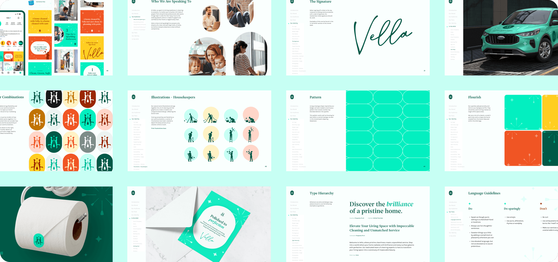
A brand refresh that truly shines
About the client
Highland Park Housekeeping spent a decade building a reputation the old fashioned way, one clean home at a time. It worked. HPH grew into Dallas's #1 cleaning service, with 42 teams cleaning across DFW. But the name that built that reputation was also boxing it in. You can't expand past Highland Park when Highland Park is your name, and HPH was ready to grow beyond the neighborhood and beyond Texas.
The task
The client had already chosen the new name: Vella, after founder and CEO's grandmother Vella Veatch, born in 1913, a woman who held hard work, resilience, and spotless grout close to heart. Our task was building an identity substantial enough to carry that name, one flexible enough to grow into new cities while keeping the substance that made HPH Dallas's best in the first place.
Type
Branding
Web Design
Who & When
Designer Duo
2023
Tools
Figma
After Effects

The workshop
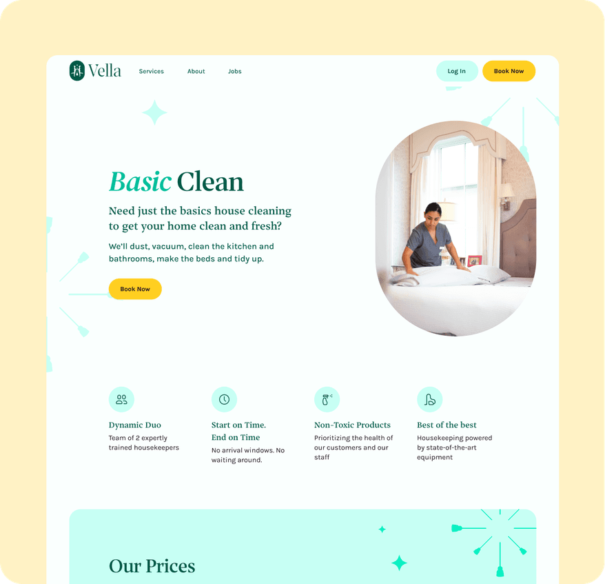
Highland Park had earned its stripes, but the personality it built along the way skewed established, expensive, and elite, a brand that had arrived rather than one still climbing. Vella needed a different posture, something youthful, economical, and unconventional, with more room to grow into new markets. What stayed constant was the warmth: friendly, playful, willing to take a chance, the traits that made HPH work in the first place. The shift wasn't a personality change, it was a recalibration, same care and character, aimed at a brand still hungry instead of one already settled.
Building on a legacy
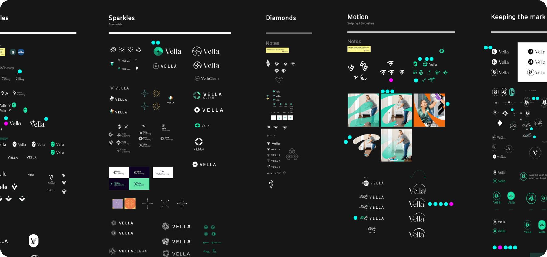
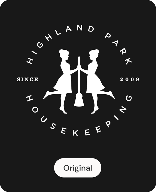
We explored a lot of ideas, different fonts and handwritten elements for something that felt personal, varying shapes of sparkles for that polished perfection, different sweeping lines to form a V that also represented the motion of cleaning. But what really intrigued us most was taking a look at the mark they already had. We already knew HPH had built up its name, their green vans recognisable in the neighbourhood. What if we brought their current emblem into a more modern era. Their current emblem consisted of two mirrored cleaners in a dainty, feminine pose, wearing dresses and long ponytails. It was a very old fashioned depiction of a cleaner, and looking at what their cleaners actually wore and how important Vella's uniforms and standards were to them, it felt right to bring that into the mark. We updated the figures to match how their cleaners actually turn up to the job, and also explored the idea of being more inclusive with more ambiguous gender depictions.
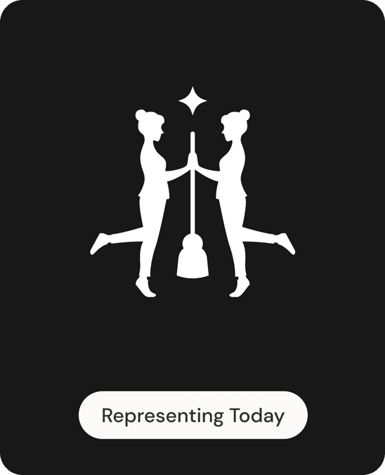

Evolution, Not Revolution
The client fell in love with the concept of evolution, not revolution, for their brand, and that became the priority when looking at every aspect. We tweaked and expanded on their existing colour palette so their green vans could still be recognisable. We added personal touches like a signature logo for certain merchandise, like calling cards. And we kept the playful nature of Vella alive, using our new mascots to create a suite of illustrations that came to life through animation.