Smarter insurance by design
About the client
Goosehead Insurance is a rapidly growing, independent personal lines insurance agency serving clients across the US. Their whole model is built around choice, shopping across 200+ insurance companies to land clients on the best policy at the best rate, something a typical single-carrier agency just can't offer. They saw an opportunity to bring that same value into an intuitive mobile app for reviewing and managing policies in one place.
The task
The chapter I want to focus on here is a specific turning point partway through: a pivot on navigation and look and feel that became necessary once the MVP had shipped. The original vision had been stripped back so much during that MVP phase that what launched was, at its core, a policy reader with far more navigation built around it than the actual content needed. It looked fine on paper. In practice, Amplitude data showed clients getting lost trying to complete what should have been simple tasks, bouncing between screens without a clear sense of where to start. That's the problem I picked up, and the redesign that followed is what this case study is really about.
Type
Mobile App
Who & When
Lead Designer
2024 – 2026
Tools
Figma
After Effects
Where We Started
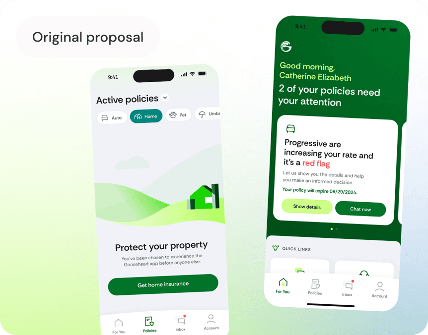
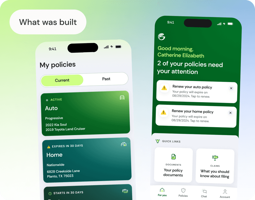
The MVP's structure centred around a homepage housing notifications and quick links, meant to be a centralised landing spot that could expand as the app grew. Alongside it sat three tabs: policy list, chat, and account. On paper it worked, but as the realities of the data we had access to set in, the homepage's functionality got stripped back until it felt flat, more of a barrier than a starting point. The Amplitude data showed why. Clients would land on policy information from a notification, then stall, unsure whether to go back, head into manage policy, or open chat. And because we'd concentrated most functionality inside individual policy pages to compensate, features only got found by clients who already knew they existed. Useful tools sat there unused. There was a quieter problem too. Our colour coding, greens for auto, different tones for home and beyond, had been built for an insurance card concept that never shipped. The colours stuck around anyway, unattached to their original purpose, and were starting to limit how far we could grow the design. Rather than scrap the structure outright, we brought in our testing team to put our assumptions to the test.
Colour With a Purpose
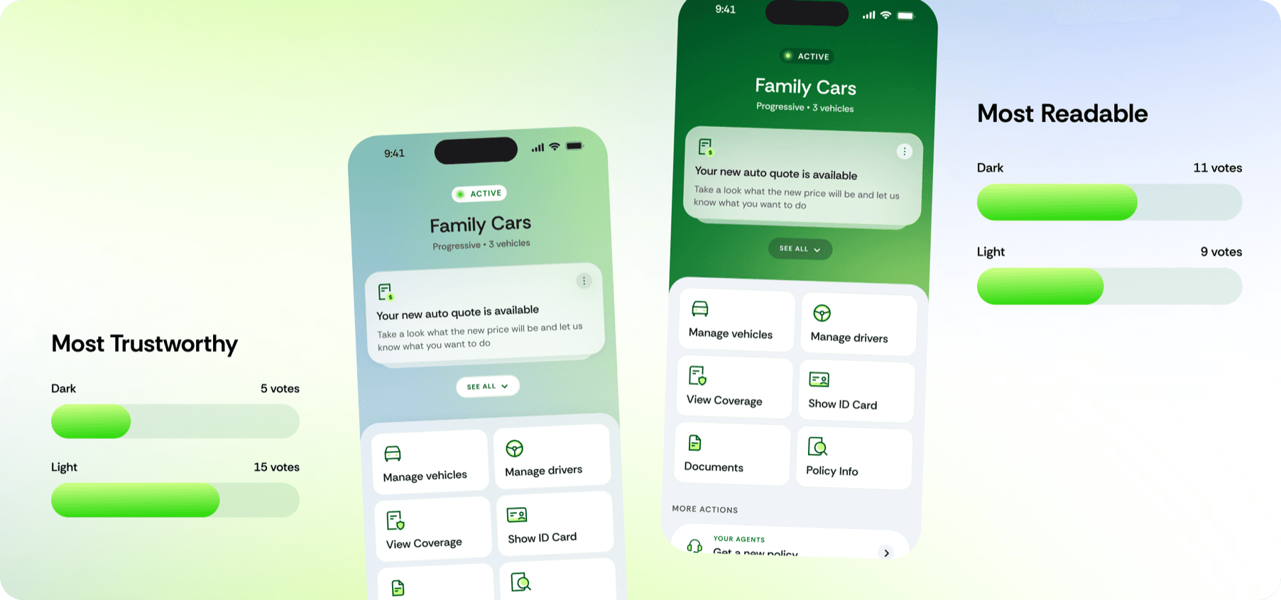
The original colour coding, one colour per policy type, was meant to help clients scan and identify at a glance. But most clients only have one or two policies, so there was nothing to scan for. The system was solving a problem that could be addressed in other ways. Rather than dropping colour altogether, we reserved the richer Goosehead green for high impact moments only, calls to action, alerts, key information, so it reads as a signal rather than wallpaper. Content-heavy screens like policy dashboards shifted to a softer teal and mint for easier reading over longer interactions. And instead of colour coding by policy type, we kept the app within Goosehead's core brand family throughout, varying intensity by context for variety without losing cohesion. A lighter theme won out in 4 of 5 categories we tested against, and the feedback backed up the numbers. Clients described it as trustworthy, calming, approachable, and professional, with several calling out the improved readability directly. One client summed it up simply: the lighter design felt like the most attractive option on offer.
Finding the Fastest Path
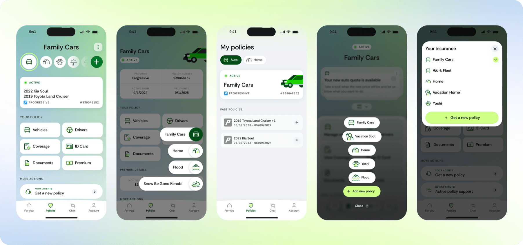
Navigation was the bigger test. We started broad, five different navigation structures put in front of clients, then took the winner from that round and pitted it against an updated version of our original pattern in a final head to head. The scenarios were built around the tasks that mattered most: finding your home policy, adding a vehicle to an auto policy, and comparing new renewal rates. Policy first won. Clients moved through tasks 60% faster on average than with the home first structure, and completed them successfully 91% of the time, compared to just 65% with the version we'd started with. Dropping clients straight into their policies, rather than routing them through a landing page first, cut out the guesswork that had shown up so clearly in the original Amplitude data.
What Grew From It
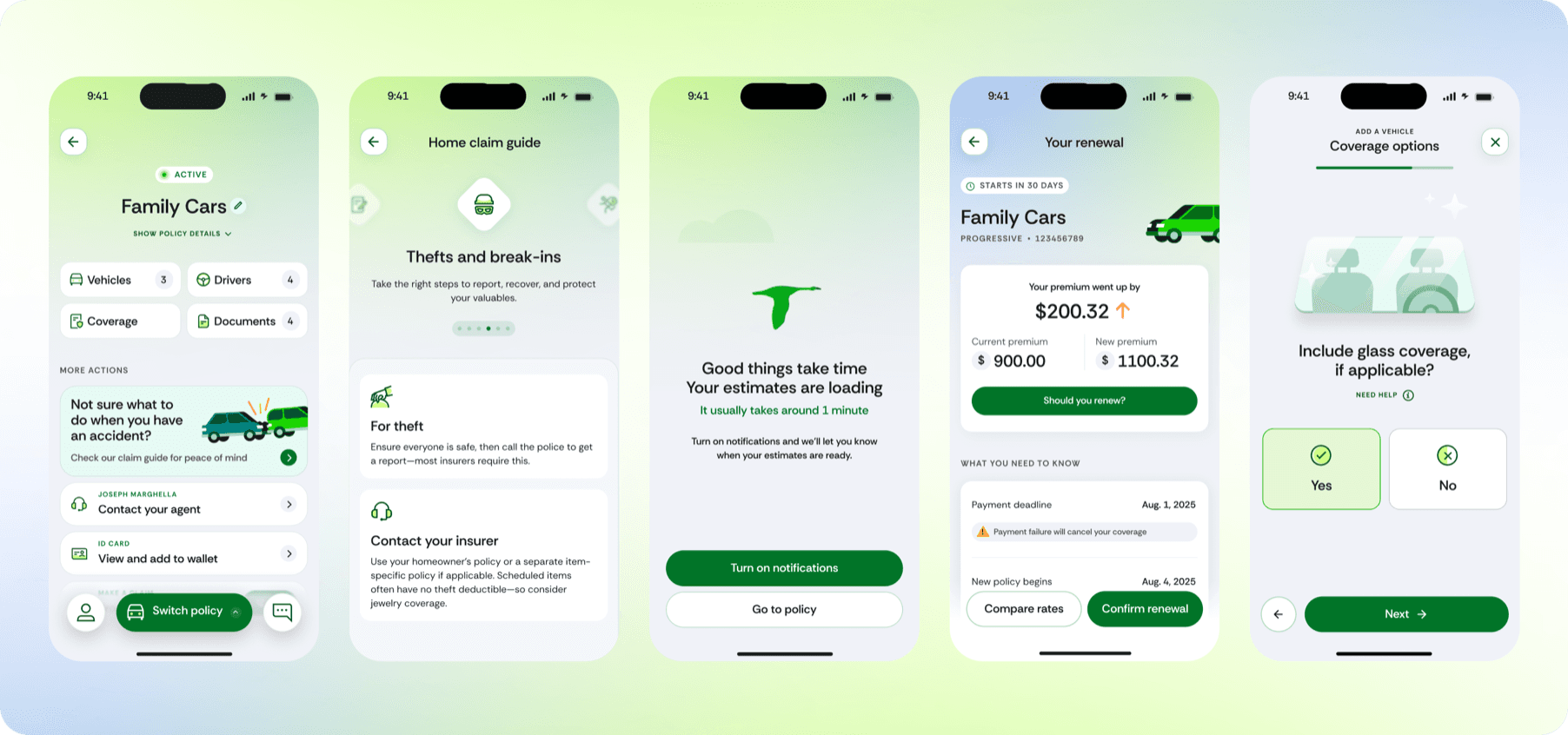
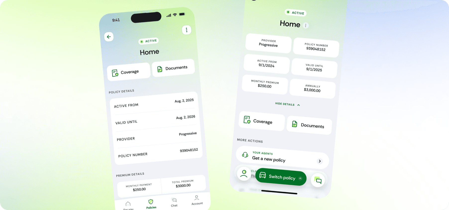
With the testing behind us, we rolled the new look and the navigation learnings out across the rest of the app. Key information moved further up front on the screens that needed it. Clients could name their own policies and vehicles, small personal touches that made the app feel like theirs. We built out new functionality too, letting clients manage their own drivers and vehicles directly, with forms designed to feel slick and genuinely easy to work through rather than something to get through. The impact went beyond the app itself. That work opened the door to two more projects with Goosehead: a redesign of their website, and a new quote comparison tool. What started as fixing a confusing navigation structure ended up reshaping how the client thought about their entire digital presence.